The QR Code CTA Formula: Wording That Actually Lifts Scan Rate
A verb-payoff-time formula for QR call-to-action wording, 25 before/after rewrites, and where the line sits relative to the code itself.
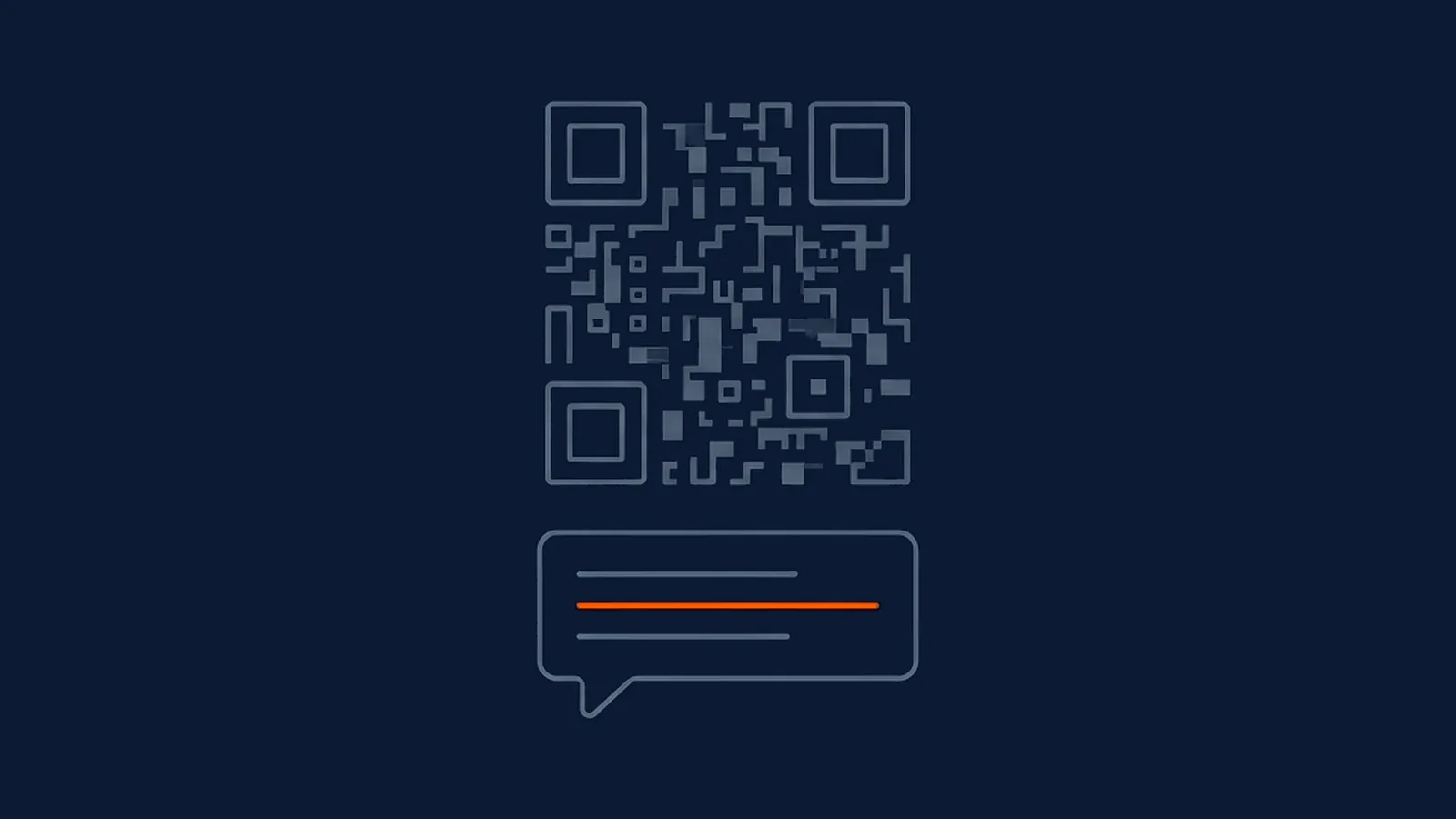
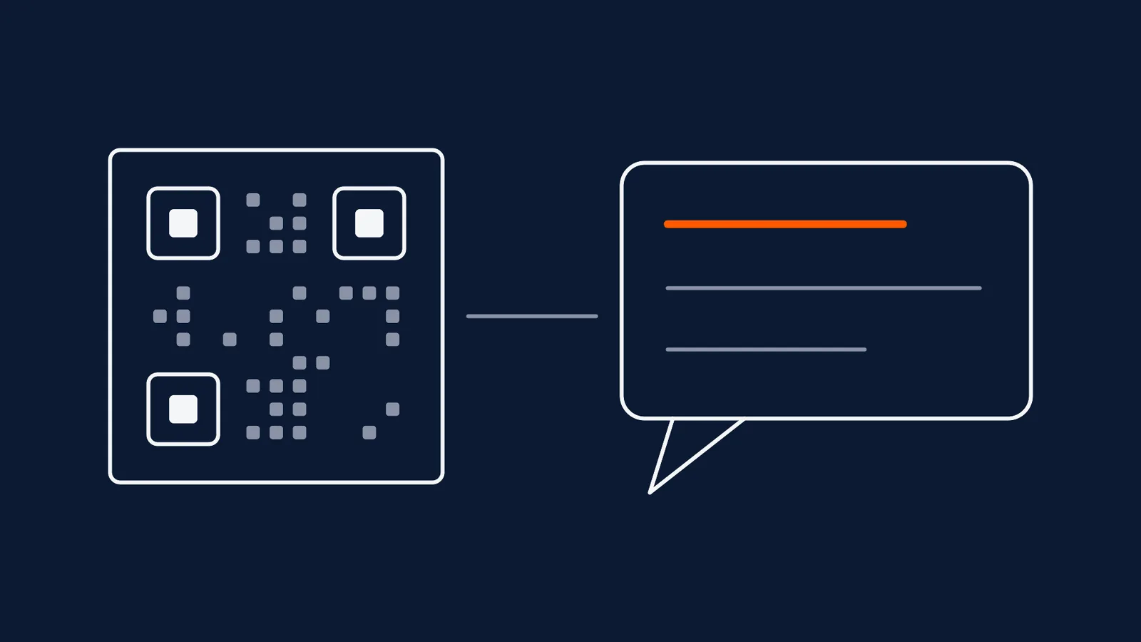
A QR code with no instruction next to it is asking a stranger to guess what happens if they point a camera at it, and most people, reasonably, don't bother finding out. The wording sitting beside the code is doing real work: it converts an ambiguous square pattern into a specific, low-risk decision a passer-by can make in under a second. Get that wording wrong and a technically flawless code, correctly sized, high contrast, tested on the actual substrate, still underperforms, because the failure was never in the code.
The formula: verb, payoff, time cost
A reliable call-to-action names three things in a short line: the action itself, stated as a verb; what the reader gets for taking it, stated plainly rather than implied; and roughly how long it takes, which reassures a busy or distracted reader that the ask is small. "Scan for the size chart, 5 seconds" does all three in six words. Drop any one part and the line gets noticeably weaker: "Scan for the size chart" without a time cost still works but asks for a small leap of faith about effort; "Scan, 5 seconds" without a payoff gives no reason at all; "Size chart available" without a verb doesn't tell the reader what to physically do.
The payoff is the part worth the most editing attention, because a vague payoff is functionally the same as no payoff. "Scan for more information" names an action and implies a small time cost through brevity, but the payoff, "more information," could mean almost anything, and a reader deciding in under a second treats vague as a reason to keep walking. "Scan for delivery slots near you" or "Scan to see this in your size" gives a reader something concrete enough to picture before they've even lifted their phone.
Twenty-five rewrites, before and after
| Context | Before | After |
|---|---|---|
| Product packaging | Scan me | Scan for cooking times by weight, 5 seconds |
| Store window (closed) | Visit our website | Scan to browse tonight, order for pickup tomorrow |
| Checkout counter | Join our loyalty programme | Scan to join, 10 seconds, no form |
| Restaurant table | Scan for menu | Scan to see the day's specials and order, 15 seconds |
| Event badge | Learn more | Scan to swap contact details instantly |
| Real estate yard sign | For more details visit our site | Scan for the full walkthrough, any time |
| Fitting room | Need a different size? | Scan to request your size at the till, 10 seconds |
| Warranty card | Register your product | Scan to register and start your warranty, 30 seconds |
| Direct mail | Click here | Scan for your personal offer, ready to use |
| Coupon insert | Redeem online | Scan to redeem at checkout, no code to type |
| Business card | Connect with us | Scan to save my number and email instantly |
| Gym poster | Sign up now | Scan to book a free trial class, 20 seconds |
| Museum exhibit label | Scan for info | Scan to hear the two-minute story behind this piece |
| Job fair flyer | Apply now | Scan to see this week's openings near you |
| Wedding invitation | RSVP online | Scan to RSVP, 20 seconds, no account needed |
| Delivery box | Track your order | Scan to see exactly where your order is now |
| Feedback counter card | We value your feedback | Scan to rate this visit, 15 seconds |
| Whitepaper handout | Download the full report | Scan to read the full report on your phone |
| Parking validation sign | Scan for validation | Scan to validate parking before you leave, 10 seconds |
| Clinic waiting room poster | Learn more about our services | Scan to check the wait time |
| Product manual cover | Scan for instructions | Scan for setup steps with photos, 2 minutes |
| Sample pack sachet | Scan to learn more | Scan to find this size near you |
| Workshop flyer | Register here | Scan to save your seat, 20 seconds |
| Cause collection box | Donate online | Scan to give, any amount, no cash needed |
| Class schedule board | Scan for the schedule | Scan to see this week's class times |
Read across the pattern rather than any single row: nearly every "before" line either names the action with no payoff, or implies a payoff so generic it could sit next to any code anywhere. Nearly every "after" line is longer by only a word or two, but that small addition is doing the entire job of turning a guess into a decision.
The words that quietly kill a scan rate
"Scan me" survives because it's short and unambiguous about the action, but it supplies no payoff at all and leans entirely on curiosity, which works unevenly depending on how intriguing the surrounding design happens to be. "Learn more" is the vaguest payoff in common use: it could describe literally any destination a code might point to, and a reader who has seen it a hundred times elsewhere has learned to associate it with generic, often unrewarding pages. "Click here" carries an instruction written for a mouse pointer rather than a camera, which is a small but real mismatch that undermines confidence in codes and copy that clearly weren't built for this medium in the first place. None of these three phrases are forbidden outright; they're simply doing less than a line built from the verb-payoff-time formula would do in the same amount of space.
Where the CTA sits matters as much as what it says
The best-written call-to-action fails if it isn't physically next to the code it belongs to. A reader scans a code and reads its instruction in a single glance lasting well under a second, which means the line has to be close enough, directly below or immediately beside the code, that both are visible without moving the eyes to a different part of the page or turning the object over. How and where a code is placed already governs realistic scanning distance and dwell time; the CTA has to respect the same constraints, sized and positioned for the same glance that finds the code itself, not tucked into body copy elsewhere on the page. A CTA correctly worded but printed on the reverse side of a flyer, or three paragraphs below the code in dense text, has effectively been separated from the thing it's meant to explain.
The CTA's visual weight also has to compete fairly with the code rather than against it. A line set in tiny grey type beneath a bold, branded code reads as an afterthought, while text that's too large or too heavily styled can crowd the quiet zone the code itself needs to scan reliably. Treating the code and its CTA as one visual unit, designed together rather than the code first and a caption bolted on afterward, avoids both problems at once.
Language and script for Indian audiences
A national campaign rarely reaches every reader equally well with a single language choice. Pairing a short English line with one regional-language line matched to the placement's actual location, Hindi in the Hindi belt, Tamil in Tamil Nadu, Bengali in West Bengal, and so on, gives more readers a line they process instantly rather than translate mentally first. Both lines should carry the same verb-payoff-time structure rather than one being a literal translation of the other; a payoff that reads naturally in English sometimes needs reshaping, not word-for-word conversion, to land the same way in another script.
Brand names and product names are the one place translation actively works against the goal. Transliterating a brand name, rendering its sound in the regional script, keeps it recognisable as the same brand a reader has seen elsewhere; translating it for meaning often produces a word nobody associates with the product at all. A payoff phrase built around a generic word, "size", "offer", "menu", translates cleanly, but the brand or product name sitting inside that phrase should keep its sound, not its dictionary meaning, across every script it appears in.
What this means for your next campaign
Write the CTA before finalising the artwork, not after, since the formula only works when there's genuine design room for a payoff and a time cost next to the code, not just a cramped afterthought squeezed into whatever space is left. Test the exact wording against the placement it will actually appear in, since a payoff that reads well on a screen during design review doesn't always survive being printed at the size and distance a real reader will actually encounter it. And treat the code and its line as one unit from the design stage onward, so neither one is finished until both are checked together, in place, at real size.
Straight answers
Is 'Scan me' really a bad call-to-action?
It's not wrong, just incomplete. It tells a reader what action to take but not why, so it depends entirely on curiosity to work, and curiosity is an unreliable motivator for someone walking past a poster or standing in a queue. A verb plus a payoff plus a time cost gives the same reader an actual reason, so 'Scan me' should be treated as a placeholder to improve on, not a finished line.
Should a QR code CTA be written in English or a regional language?
Both, when the placement and audience make that practical: an English line for reach and consistency with brand material, plus one regional-language line matched to where the code is physically placed. A single national line rarely fits every region equally well, and a short, well-chosen regional line next to the English one usually outperforms trying to pick one language for the whole country.
Where exactly should the CTA text go relative to the QR code?
Directly below or immediately beside the code, close enough that a glance takes in both at once, never on a separate panel or a different side of the same page. A reader who has to search for the instruction after finding the code has already lost the moment of intent that made them look in the first place, and a surprising number of otherwise well-designed codes fail this simple proximity test.
Does a longer, more detailed CTA work better than a short one?
No. A CTA is read in the same brief glance that finds the code itself, so it has to work in well under a second. The verb-payoff-time formula deliberately produces short lines, typically four to seven words, because anything long enough to require a second look defeats the purpose of a call-to-action placed next to a code someone is deciding whether to scan at all.