Designing a QR Code That Looks Like Your Brand Without Breaking the Scan
How much a centre logo can cover, why colour choice is a decoding decision, and the test protocol to run before a branded QR code goes to print.
A QR code has room for brand personality, a logo, a colour palette, sometimes a frame, but every one of those choices spends capacity the code needs for something else: recovering from print imperfections, handling, and everyday wear. Understanding where that capacity comes from, and how much of it a given design choice actually costs, is what separates a branded code that scans reliably from one that looks right on screen and fails in the field.
Where the spare capacity for a logo comes from
QR codes carry Reed-Solomon error correction, a scheme that adds redundant data so a scanner can reconstruct the original information even when part of the code is damaged, dirty, or, in this case, deliberately covered by a logo. This isn't a special feature for branded codes; it's the same mechanism that lets a scratched or smudged code still scan normally. Four error correction levels are available, trading code density for how much damage they can recover from: Level L recovers roughly 7% of the code, Level M roughly 15%, Level Q roughly 25%, and Level H roughly 30%, which is why Level M, offering a reasonable balance for typical use, is the most commonly chosen default when no logo or heavy branding is involved.
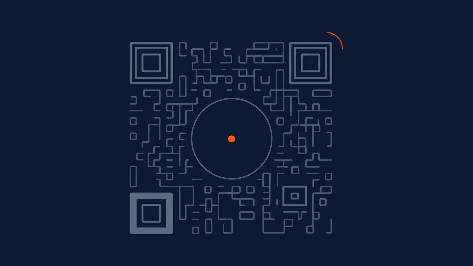
A centre logo should only be added at Level H, the highest available, and even then the logo shouldn't consume all 30% of that recovered capacity. Vendor guidance generally recommends keeping the logo itself to roughly 10-15% of the code's area, deliberately leaving 15-20% of the code's recovery headroom in reserve for the damage every printed code eventually accumulates: scuffs, dirt, a fold, fading. Spending the entire error-correction budget on the logo at design time leaves nothing left over for the wear the code will actually encounter after it leaves the studio.
Placement of the logo matters as much as its size. The centre of the code is the safest spot specifically because it's the position furthest from the three large finder-pattern squares in three of the code's corners, the patterns a scanner locates first to orient and size the whole symbol before it starts reading data. A logo placed anywhere near a corner, rather than dead centre, risks interfering with the one part of the code a scanner absolutely cannot do without, regardless of how much error-correction headroom is technically available elsewhere in the grid.
Two versions is often the better answer
Where a code needs to work reliably across genuinely different conditions, a controlled retail environment and a harsher outdoor or industrial one, for instance, a single branded design asked to do both jobs is often the wrong compromise. Producing two versions instead, a fully branded code for premium, controlled placements and a plain, high-protection code with no logo for placements facing heavier wear, gives each version the error-correction budget its actual environment calls for, rather than settling for one design that's slightly over-engineered for the easy placement and slightly under-protected for the hard one.
Error correction level and what it's actually for
| Level | Recovery capacity | Typical use | Logo-safe? |
|---|---|---|---|
| L | Up to ~7% | Clean, controlled environments: screens, digital-only codes | No — leaves almost no room for a logo or wear |
| M | Up to ~15% | Most everyday printed material: flyers, business cards, indoor signage | Not recommended for a logo — most of the headroom is needed for ordinary wear |
| Q | Up to ~25% | Outdoor or higher-handling placements: packaging, event materials | Marginal — usable for a very small logo, but with little reserve left |
| H | Up to ~30% | Any code carrying a logo, or facing heavy handling and environmental wear | Yes — the only level with enough spare capacity to safely cover part of the code |
Why colour is a decoding decision, not an aesthetic one
A scanner doesn't see colour the way a person does. It reads contrast, the difference in light reflected back from modules versus background, converted to a simple dark-or-light read at each point in the grid. Two colours that look clearly distinct to a human eye, a dark grey module on a black background, a saturated brand blue on a similar-toned background, can reflect nearly identical amounts of light back to a camera sensor and register as indistinguishable, which is a scan failure a designer looking at the file on a monitor would never predict.
The safe starting point remains dark modules on a light background, ideally close to black on white or a comparably strong pairing, because it maximises the contrast margin across the widest range of cameras, lighting conditions, and print qualities. Brand colours can absolutely be used, but the selection process needs to run through a contrast check first: does this specific colour pairing hold enough difference in reflected light to read clearly on a lower-quality camera, in dim lighting, at the print size the code will actually ship at. Choosing colours by eye on a bright monitor and assuming they'll translate is one of the most common, and most avoidable, causes of a branded code that fails quietly in the field while looking fine in every design review.
Why inverted codes fail more than they should
Reversing the usual pattern, light modules on a dark background, is technically permitted by the QR standard and is not automatically a failure. What makes it riskier in practice is scanner behaviour rather than the standard itself: most scanning software, including the camera-based scanners built into phones, is tuned to expect dark modules on a light background as the default assumption, since that's overwhelmingly the common case in the real world. An inverted code asks the scanner to work against that built-in assumption, and while modern, well-maintained scanning apps generally handle it, older devices and lower-quality third-party scanner apps are meaningfully more likely to fail on an inverted code even when its contrast ratio is, on paper, just as strong as a standard one.
If a brand identity genuinely calls for an inverted palette, treat it as a design choice that needs more testing, not less: more devices, a wider range of lighting, and older hardware specifically included in that testing pool, rather than assuming a code that scans on a current flagship phone will behave the same way everywhere else.
The safer route, where the brand can accommodate it, is to keep the module colours in the conventional dark-on-light arrangement and express brand identity through the surrounding design instead, a frame, a background colour outside the quiet zone, a call-to-action styled to match brand typography. This gets the visual distinctiveness a marketing team wants without asking the code itself to work against the assumption most scanners are built around.
A test protocol worth running before any print commitment
None of the guidance above substitutes for testing the actual finished design, because logo size, colour choice, and inversion all interact with each other and with the print medium in ways that are hard to predict from a single design review. A workable protocol before committing to a print run: five different devices, deliberately spanning old and new, and more than one operating system; three realistic scanning distances matching how the code will actually be encountered, close-range for packaging, mid-range for a counter standee, further for a poster; and two different lighting conditions, at minimum a bright, evenly lit setting and a dim or mixed-lighting one, since lighting is one of the most common causes of a design that scans perfectly in an office and fails on an actual shop floor or event space.
This is the same discipline packaging print production already demands for size and substrate reasons; branded design adds colour, logo coverage and inversion as three more variables that deserve the same real-world test before a print run locks, not a screen proof treated as sufficient evidence. Simulating handling and wear during the same test round, not just a single clean scan, catches problems the pristine first print never reveals: crumple a paper sample and smooth it out again, splash water on a laminated version, leave an outdoor sample under direct light for a few hours, then re-scan each one. The full pre-print checklist folds this test protocol into a broader set of checks worth running on every printed code, branded or not.
Where the CTA sits matters as much as the code's own design
A well-designed, thoroughly tested code still depends on the words around it to earn the scan in the first place. The call-to-action next to a QR code is a separate discipline from the code's visual design, but the two are usually judged together by whoever's looking at the final artwork, and a beautifully branded code paired with a generic "scan me" label wastes the design effort spent getting the logo and colours right.
What this means for your next campaign
Reserve a centre logo for Level H error correction only, and keep the logo itself to a modest fraction of that level's headroom rather than spending all of it. Choose colours by testing contrast under a camera's reading of them, not by eye on a monitor. Treat an inverted, light-on-dark palette as a choice that needs extra testing, not a stylistic swap with no cost. And run the five-devices, three-distances, two-lighting-conditions test on the actual finished artwork before any print run is committed, since a design that fails in the field after launch costs far more to fix than the ten minutes this test takes beforehand.
Straight answers
How much of a QR code can a centre logo cover before it stops scanning?
Vendor guidance generally puts the safe range at roughly 10 to 15% of the code's total area at the highest error correction level, which recovers up to 30% damage overall and deliberately reserves the rest of that headroom for real-world wear rather than spending all of it on the logo. Going meaningfully beyond that range is gambling with headroom you'll need later for scratches, print imperfections, and handling.
Why does adding a logo to a QR code require a specific error correction level?
Because a centre logo physically covers part of the code's data pattern, and only error correction can make that missing data recoverable. QR codes support four error correction levels recovering roughly 7%, 15%, 25% and 30% of the code respectively; a logo should only be added at the highest of these levels, since anything lower leaves too little spare capacity once the logo's coverage is subtracted from it.
Can I invert a QR code's colours, light modules on a dark background, without hurting scan reliability?
It's riskier than it looks. Most scanning software is tuned to expect dark modules on a light background as the default case, so an inverted code asks the scanner to work against its own assumptions, and older or lower-quality scanning apps are more likely to fail on it even when contrast is technically strong. If the brand look genuinely requires an inverted palette, test it more thoroughly than a standard code, not less.
Is colour choice on a QR code a design decision or a technical one?
Both, but the technical constraint comes first. A scanner reads contrast between modules and background, not colour as people perceive it, so a colour pairing that looks distinct to the eye, dark grey on black, a mid-tone on a similar mid-tone, can read as nearly identical to a camera and fail to scan. Pick brand colours that hold strong contrast under a camera's reading of them, then treat the aesthetic result as a happy consequence, not the starting point.
-
Official explanation of QR code error correction (Reed-Solomon), from QR code's original developer, including the Level M (15%) and Level Q (25%) recovery mechanism
https://www.qrcode.com/en/about/error_correction.html -
Practical vendor guidance on the four error correction levels (7/15/25/30% recovery), the recommended ~10-15% logo coverage at Level H, and a print-testing checklist, self-reported by a QR code platform
https://www.the-qrcode-generator.com/blog/qr-code-error-correction